Visualizing 48 Months Of Credit Card Spending With PyPDF, SQL & Looker
Constrained by the limitations of my credit card’s pre-filtered dashboards, I used Python, SQL & Looker to create my own.
In fashion (not that I’m a style icon), there is a fancy term for custom-made clothing, “bespoke.” The advantage of this approach (and $$$$) is that the end product is exactly fit, tailor-made, to the unique proportions of your body.
The entire reason data engineering and data analysis exists is because, like the wealthy who demand a perfect fit, internal stakeholders seek solutions that are relevant to their business’ needs, like tracking progress against quarterly and annual goals. Luckily for those employed in roles serving data consumers, these individuals often find vendor-created UIs and dashboards to be too broad to be applicable to their use cases.
Add in the fact that few vendor dashboards generate and send automatic reports and you can understand the appeal of having a Business Intelligence division.
In completing a yearly audit of my family’s finances, I found myself in the dual position of engineer and stakeholder seeking a solution to what I believed to be a reasonable request —
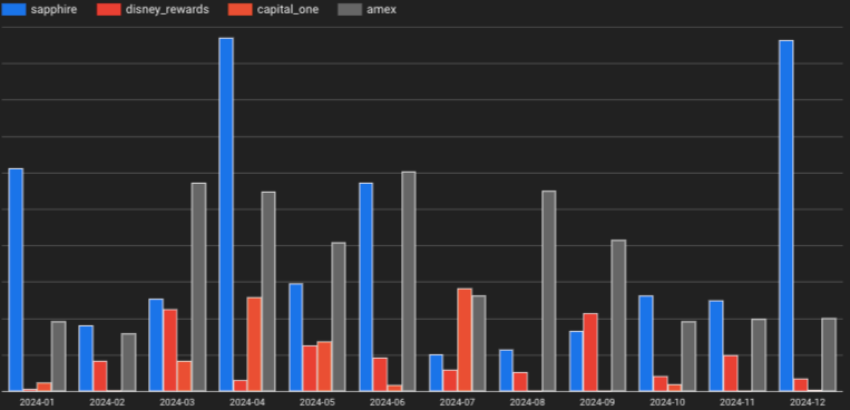
“Aggregate all spending on x card for calendar year 2024.”
As you can imagine, this was too much to ask for the following reasons:
- Dashboards or UI features had time constraints that often wouldn’t offer insights far enough in the past
- UI dashboards focused too much on balance comparisons while I wanted overall spend
- On some cards which I’m only an authorized user on (not an owner), I couldn’t even see spending in a dashboard
You might ask: Shouldn’t historic data attributed to cards you own be available through an intuitive user or developer-friendly method like an API?
Of course it should.
But financial data falls into the nuclear waste category of personal information, PII, and exposing it via an API that’s not properly secured would put my personal information at risk.
And the biggest reason that I’m going to the trouble to assemble a custom-made dashboard…
To combine (aggregate) spending across multiple cards, accounts and creditors.
This will let me know exactly how much money I blew–I mean spent–in calendar year 2024.
Without an API, I invested between 5–10 hours creating scripts that would read, process and upload spending data for the past 12 months across 4 cards, 48 individual statements in all.
All for this graph…
And now, how I got there.
Build Your Pipeline To A Data Engineering Career
You’ve reached the limit of the public preview. The full version of this post includes the implementation details: The code, the edge cases, and the "why" behind the architecture.
When you join PipelineToDE, you get:
- The DA → DE Pathway Course: A structured roadmap to bridge the gap between analysis and engineering.
- Weekly Senior Deep Dives: Fresh, tactical insights on Python, Cloud (GCP/AWS), and modern orchestration delivered every week.
- Production-Ready Blueprints: Access to 80+ protected stories and code repos from my time in the trenches as a Senior DE
- The DE Job Board (Coming Soon): Exclusive access to a curated board of high-agency Data Engineering roles.